Sikuli Guide
Added in version 1.1.1.
IMPORTANT NOTE:
The Guide feature has been completely revised. The following original documentation might give an impression about the intention and the principally available features, but might not work as expected in 1.1.1+
For information about the API you currently have to look into the sources (Lib/guide/guide.py for Python and org.sikuli.guide.xxx for Java). The revision focused on the static features (annotation types), so the interactive features might not work as expected.
This feature has the state experimental, meaning it might change at any time without notice and without any guarantee to be fully backwards compatible.
Added in version X1.0-rc2.
Sikuli Guide is an extension to Sikuli that provides a revolutionary way to create guided tours or tutorials for GUI applications. The revolutionary aspect is that the content of the tours or tutorials can be displayed right on the actual interface, rather than in a video or a series of screenshots on a web page. All this can be combined with guided user activities directly in the respective GUI applications using all the other Sikuli features.
Quick Start
First Example
In our first example, suppose we want to create a guided tour of this very documentation page you are currently reading. We want to bring your attention to the logo picture to the right. Using the functions provided by Sikuli Guide, we can write the following script to accomplish this:
When you run this script, Sikuli Guide will search for the logo’s image on the screen, highlight it, and display the text ‘’This is Sikuli’s logo’’ below the image, like the figure below:
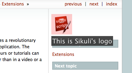
Again, this happens in the actual interface, rather than in a video or a screenshot. The logo image that is highlighted is the actual interface element users can click on.
Let’s explain the script line by line. The first line is an import
statement that tells Sikuli to load the Sikuli Guide extension. The secod line
uses the text(pattern, text) function to add text
next to a given pattern, in this case, the logo image. Note that by default
the text added is not displayed immediately, it is only internally added
to the visual element. In the third line, we call
show(secs) to explicitly tell Sikuli Guide to now display
all registerd annotation elements (in this case only the
text) for the duration specified by secs.
Below is a YouTube video of this example.
Adding Multiple Annotations
It is possible to add text or other annotations to multiple visual elements before
calling show(secs) in order to show them on the screen at the same time.
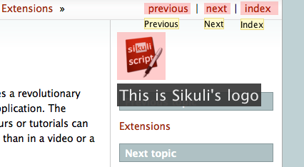
The script above uses the function tooltip(text) to add tooltips to
three links in addition to the text annotation. The result of running this
script is shown below:
Rather than showing the annotations all at once, we can also show them one by
one using separate show() statements. Below is an example where we cycle
through the three links and show the tooltip of each link one at a time.
The result of running this script is shown below (sorry, no animation):
Adding Interaction
Another way to control the flow of a guided tour is to display a dialog box
and let users click on a button to continue to the next part of the tour.
Sikuli Guide provides a function dialog(message)
to accomplish this easily. Below is an example using this function to create a
two-part guided tour.
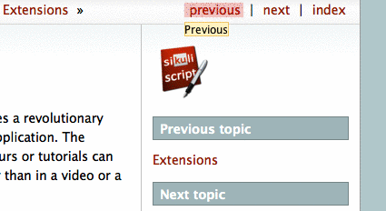
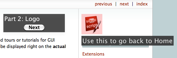
The tour presented by the script above introduces the navigation links above
and the Sikuli’s logo as a shortcut to go back to the documentation’s HOME
page. The function call dialog("Part 1") indicates the tour will show
a dialog that displays the message specified by the string argument
(i.e., Part 1: Navigation Links). The following call to show() will
actually display the dialog along with the text elements spcified earlier.
The figure below shows what happens after Line 3:
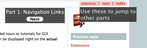
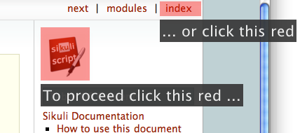
After users click on the Next button, the tour moves to the next part. The screen will look like below:
Making a Region clickable
You might use the feature clickable(PSRM), to make a region sensitive for clicks.
The script waits until the user clicks one of the two highlighted areas.
Function References
element: when used as a parameter, it can either be something that can be used with a find() (Pattern or string as image file name or just plain text), a Region or Match object or another Guide element.
All funtions return the created element, so later the layout can be changed by specific setters or they can be used as target elements for other elements
Static Annotations
- guide.rectangle(element)
Add a rectangular overlay as frame on the specified element’s region.
- Parameters:
element – a suitable
- guide.circle(element)
Add a circle around the specified target’s region.
- Parameters:
element – a pattern, string, region or match
- guide.text(element, txt)
Add some text to one edge of the specified element
- Parameters:
element – a suitabel element
txt – a string as text to display
- guide.tooltip(element, txt)
Add a tooltip (small font in a light yellow box). same as text(), but with predefined layout. As usual for tooltips: the text should be a short oneliner
- Parameters:
element – a suitabel element
txt – a string as text to display
Interactive Elements
- guide.button(element, name)
A clickable button showing it’s name as the button text.
- Parameters:
name – a string as text to display, later used as reference to check how the button was used
Control
- guide.show([seconds])
Show static and interactive components added so far for the specified amount of time.
- Parameters:
seconds – a decimal number as display duration in seconds
The default duration is 10 seconds. If interactive elements (either one or more clickable elements or a dialog box) were previously added, it waits until the user interacts with one of these elements. At this time all elements vanish and are discarded.
